Inspiration
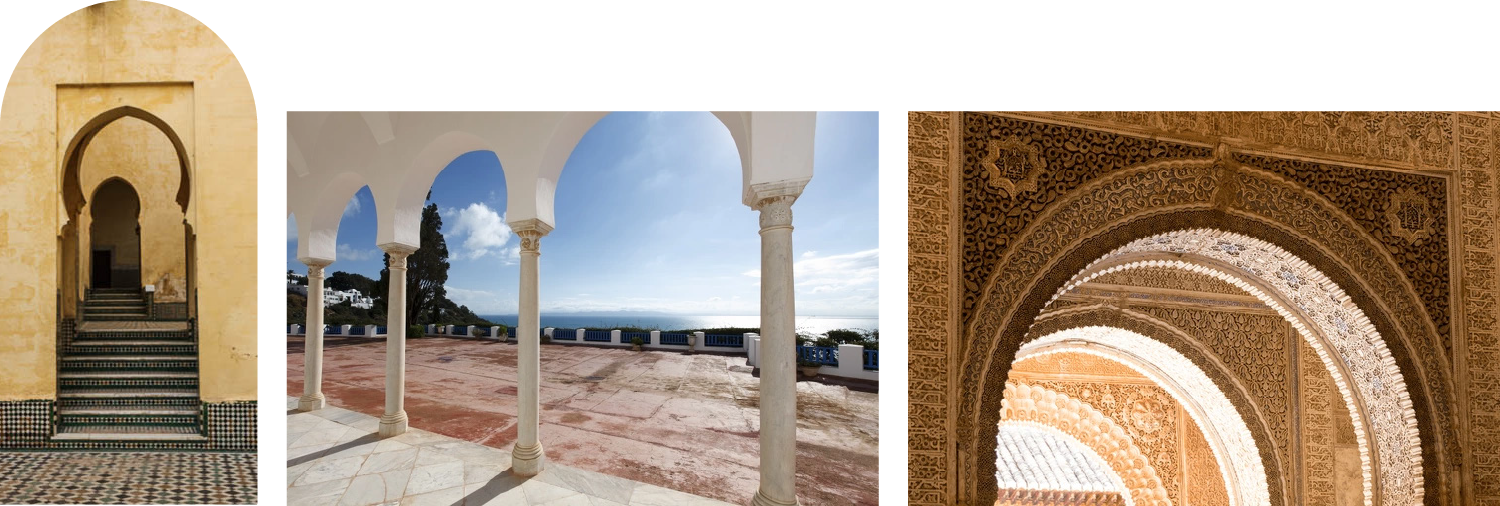
Inspired by doors and archways dating back to the 7th century, this geometric beauty with solid engineering is definitive of the region. Showcasing intricate designs, they transformed simple openings into expressive elements that carry both visual and symbolic weight.
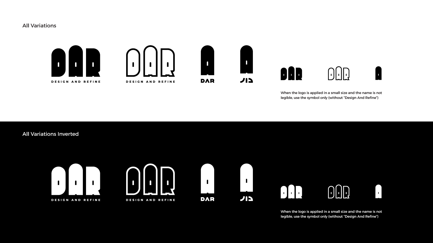
Secondary and Compact Logo Versions
Logo Spacing
Logo as a Container
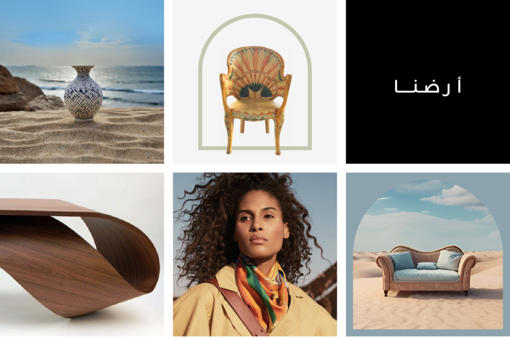
Photography/ Visual Language
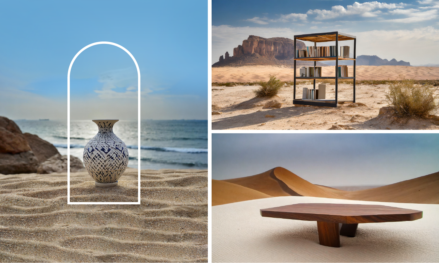
DAR’s images should tell a story. They should reflect a deep understanding of the region’s landscape and culture and take pride in it.
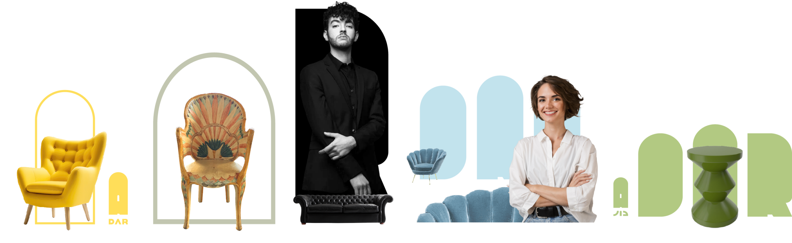
When shooting furniture, make sure the piece and it’s intricacies are the point of focus.
When a designer is featured let them be themselves. Their photos should not feel posed.
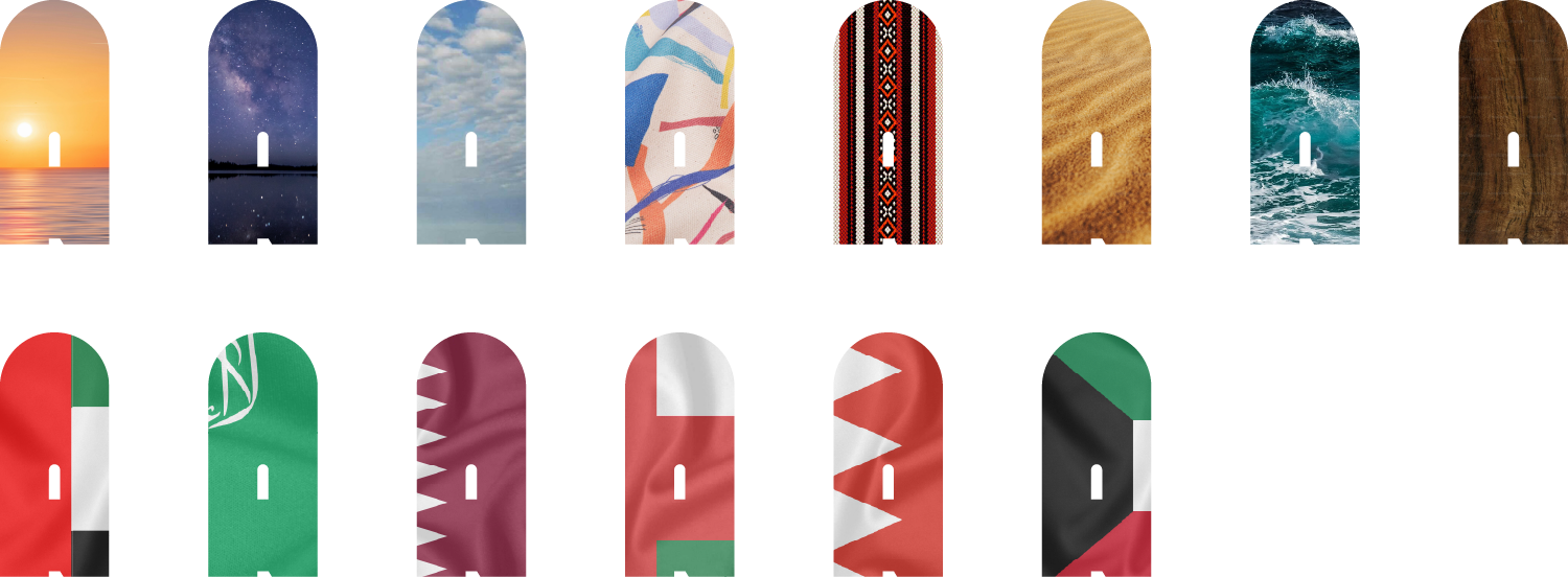
The arch is a symbolic representation of DAR’s door to imagination and creativity. It can be used as part of the visual to highlight a piece of furniture to make it stand out in the scene, as a design element against a solid background or as a masking frame.

Keywords
Regional, Global, Pride, Artistic, Natural
Colours
DAR’s primary colours are black and white.
This is to maintain a neutral, classic, elegant and sophisticated base.
Since the brand will be working in collaboration with designers, each with their own style, the colour palette is diverse and flexible.
Try to maintain harmony in the overall visual and avoid highly saturated, loud colours.
Tone of Voice
The brand always speaks as a collective and takes pride in the heritage and culture of the region.
At the same time it speaks of one world and appreciates new ways, adapting to a rapidly changing global landscape.
This is reflected in the way the designers are given freedom to express themselves and create their work – Locals with global aesthetics.
This would define DAR as a local international brand.
When communicating in Arabic, use Fuṣḥā for general communication.
When communicating in a specific country or to a targeted audience, feel free to use their dialect and phrases.
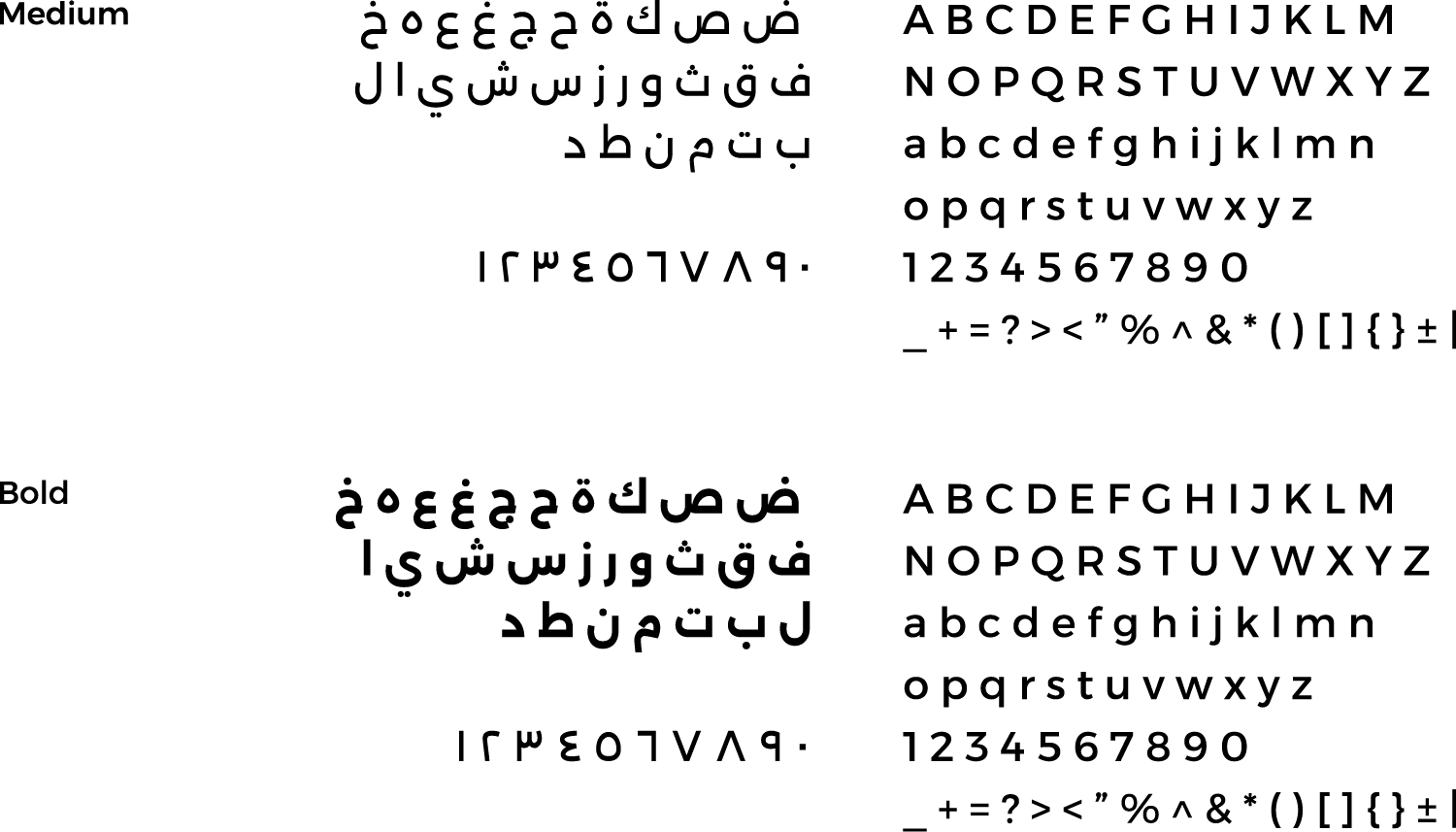
Typography